How a Responsive Website Boosts Search Ranking & User Experience

Responsive Website Design Dover DE._celestialinfotech.com

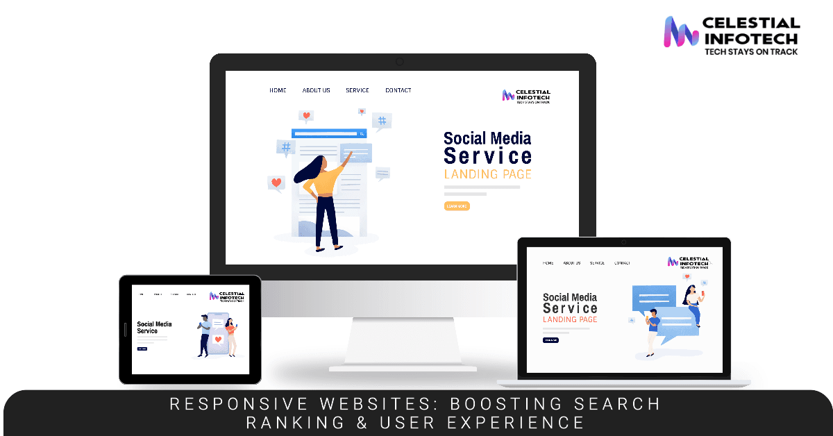
At Celestial Infotech, we understand the ever-evolving digital landscape and the crucial role your website plays in attracting and retaining customers in Dover, Delaware. In today’s mobile-driven world, where users access information from a variety of devices, a responsive website design is no longer a luxury – it’s a necessity.

This blog post dives deep into the concept of responsive websites, exploring how they enhance user experience (UX) and propel your website’s search ranking (SEO) in the eyes of Google, particularly after its recent March 2024 update emphasizing high-quality content and a user-centric approach.

What is a Responsive Website?

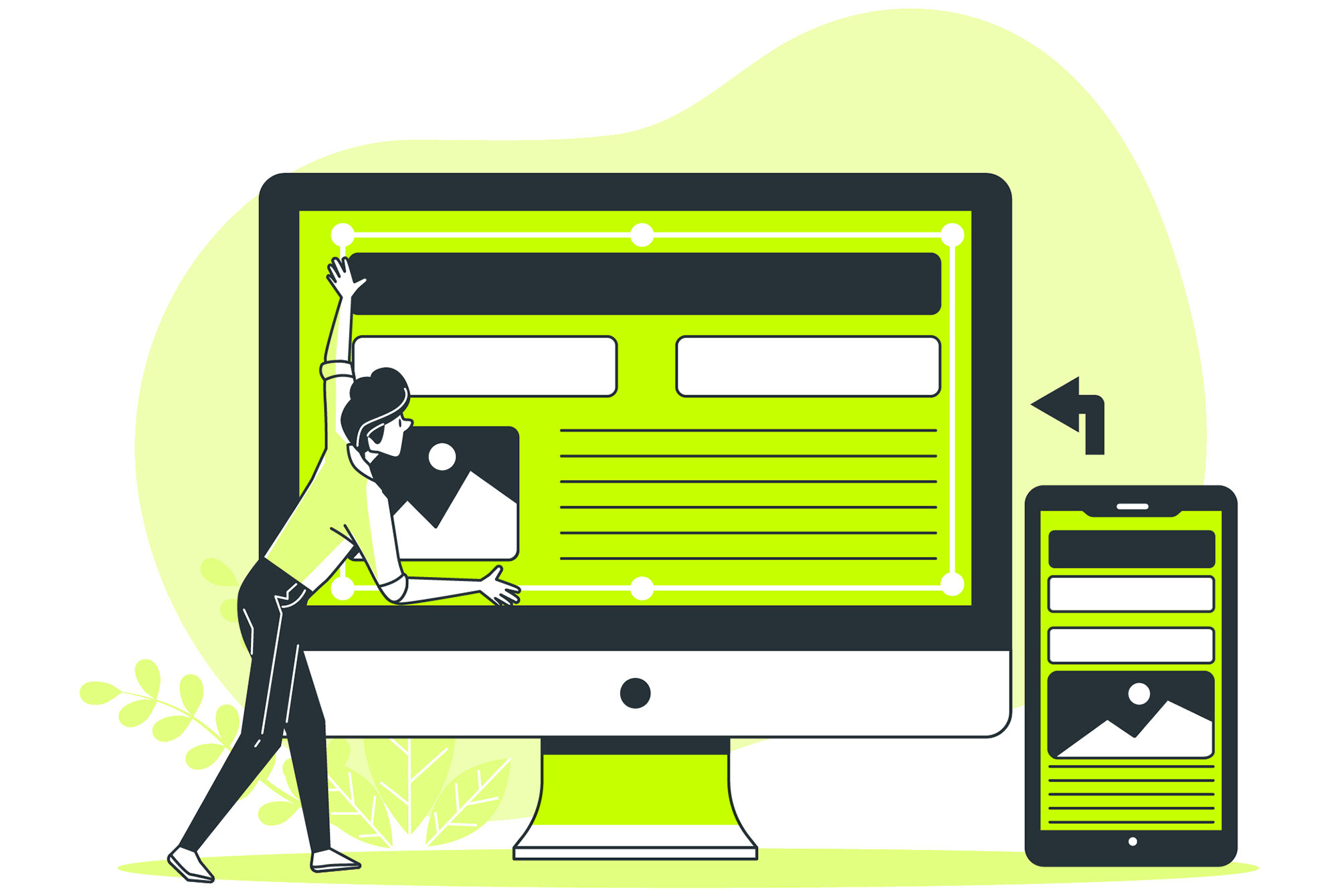
Imagine a website that magically adjusts its layout and content to perfectly fit any screen size, be it a desktop computer, a tablet, or a smartphone. That’s the magic of responsive website design. It utilizes coding techniques and flexible layouts to ensure your website delivers an optimal viewing experience regardless of the device used to access it.

Think about it – a significant portion of your target audience in Dover likely uses their smartphones to browse the internet. A non-responsive website on a mobile device translates to tiny text, clunky navigation buttons, and frustrating zooming in and out. This not only creates a negative user experience but also discourages visitors from exploring your website further.

Responsive Design: A Boon for User Experience (UX)

Let’s delve into the specific ways a responsive website design elevates user experience:
  • Effortless Navigation: Imagine a potential customer in Dover searching for your local business on their phone. With a responsive website, they can effortlessly navigate through menus, click on call-to-action buttons, and access relevant information, all without the frustration of pinching and zooming. This seamless experience fosters user engagement and keeps them exploring your offerings.
  • Enhanced Readability: Responsive design ensures that text automatically adjusts to the screen size, eliminating the need for users to squint or zoom in to read content. This makes it easier for visitors to consume information, promoting better understanding and a more pleasant experience.
  • Faster Loading Speeds: Responsive websites are typically designed to load quickly across various devices. This is crucial for capturing the attention of mobile users who are often impatient with slow-loading websites. Faster loading times not only improve user experience but also contribute to better search rankings (more on that later).
  • Increased User Engagement: A user-friendly website translates to longer session times and deeper engagement with your content. Responsive design encourages visitors to explore different sections, interact with features, and ultimately convert into leads or paying customers.

Responsive Design: The SEO Powerhouse

In March 2024, Google rolled out a core update emphasizing high-quality content and user experience as key ranking factors. This means websites that prioritize user experience have a significant edge in search results. Here’s how responsive design aligns with Google’s SEO best practices:

  • Mobile-First Indexing: Google now prioritizes mobile-friendly websites in search results for mobile searches. Since a significant portion of web searches originate from mobile devices, a responsive website ensures your business gets seen by potential customers in Dover, regardless of the device they use.
  • Improved Page Experience: Google considers factors like mobile-friendliness and fast loading speed when ranking websites. Responsive design tackles both these aspects, creating a positive page experience that search engines reward with higher visibility.
  • Lower Bounce Rate & Higher Engagement: Responsive websites typically have lower bounce rates (users leaving quickly) and higher engagement metrics (longer session times, more page views). These positive user signals are crucial ranking factors for Google, indicating a website that delivers value to its visitors.

The Dover Advantage: Responsive Design for Local Businesses

For a responsive website design offers a distinct advantage:
  • Reach a Wider Local Audience: Imagine a potential customer searching for your services on their phone while on the go. A responsive website ensures your business appears prominently in search results and delivers a user-friendly experience, increasing the chances of them contacting you or visiting your store.
  • Positive Online Reviews: A user-friendly mobile website encourages visitors to engage with your business and potentially leave positive online reviews, a major factor in local SEO success. Responsive design plays a key role in fostering this positive user experience.
  • Increased Conversions: Responsive websites lead to a more engaged user base, which can translate into a higher conversion rate – the percentage of visitors who take a desired action, such as making a purchase or contacting your business.
Responsive website design on a computer, tablet, and phone screen_celestialinfotech.com

Advanced Responsive Website Resource

We understand the unique needs and challenges of businesses in Dover, DE. Our team stays updated on local trends and user behavior to ensure your website resonates with your target audience.

Investing in a Responsive Website – A Smart Move for Dover Businesses

At Celestial Infotech, we understand the importance of a responsive website for businesses in Dover, DE. We offer comprehensive responsive website design services, ensuring your website delivers an exceptional user experience across all devices. Our team of experienced designers and developers leverages the latest technologies and best practices to create responsive websites that are not only visually appealing but also functionally superior. Here’s what sets Celestial Infotech apart:

  • Customized Design: We understand that every business is unique. Our responsive website design solutions are tailored to your specific brand identity, target audience, and business goals in Dover.
  • Focus on User Experience: We prioritize user experience (UX) in every step of the design process. Our websites are intuitive, easy to navigate, and optimized for optimal user engagement.
  • Mobile-First Approach: We recognize the dominance of mobile browsing in Dover. Our websites are designed with mobile users in mind, ensuring a seamless experience on any device.
  • Performance Optimization: We build websites that load quickly and efficiently across various devices and internet connections. This not only improves user experience but also contributes to better search engine ranking.
  • Search Engine Optimization (SEO) Integration: Our responsive websites are built with SEO best practices in mind, helping your business achieve higher visibility in local search results for Dover.

The Celestial Infotech Difference:

  • Transparent Communication: We believe in clear and consistent communication throughout the design process. You’ll be involved in every step, from initial concept to final launch.
  • Ongoing Support: We don’t just build websites; we partner with you for long-term success. Our team offers ongoing support and maintenance to ensure your website remains responsive, secure, and up-to-date.
Ready to Take Your Dover Business Online?

If you’re a business owner in Dover, DE, and recognize the importance of a responsive website design, Celestial Infotech is your ideal partner. We offer a free consultation to discuss your specific needs and showcase how a responsive website can elevate your online presence and attract more customers.

Contact us today and unlock the potential of a responsive website!

Beyond the Blog: Additional Resources

We understand that navigating the world of responsive website design can be overwhelming. To empower you further, we’ve compiled some valuable resources:

Investing in a responsive website design is an investment in the future of your Dover business. Partner with Celestial Infotech and unlock the power of a user-friendly, SEO-friendly online presence that attracts and converts customers.

FAQs

A responsive website automatically adjusts its layout and content to fit any screen size, ensuring a seamless user experience on desktops, tablets, and smartphones.

A significant portion of your target audience in Dover likely uses their phones to browse the internet. A non-responsive website creates a negative user experience and discourages mobile users from exploring your offerings. Responsive design improves user experience, boosts search ranking, and helps reach a wider local audience.

Google prioritizes mobile-friendly websites in search results. Responsive design ensures your website is mobile-friendly, improves page speed, and reduces bounce rate (users leaving quickly), all of which contribute to higher search ranking.

With a responsive website, your business appears prominently in search results for mobile searches in Dover, increasing the chances of potential customers finding you.

Our team understands the unique needs of Dover businesses and focuses on user experience, mobile-friendliness, and local SEO best practices. We offer ongoing support and transparent communication throughout the design process.